Almost 2 years ago, I wrote a blog post about creating a Windows-95-like UI with Jetpack Compose. And since then, I have barely touch it for more than a year, because
- I started doing less and less coding day-to-day as I take on more management roles
- I stuck at Compose (and still am)
- Maybe the UI library would have been better to target desktop UI building (which is possible now thanks to JetBrains, but I am kinda too lazy actually finish that up)
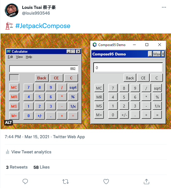
So naturally, the only logical thing to do would be to create another pet project, in this case, travel from the 90s to the early 2010s, still in Seattle, and that's how Metro-Compose is born.
Disclaimer: This is still not a tutorial/how-to of Jetpack Compose at all. This is just blog post of my experience of using it.
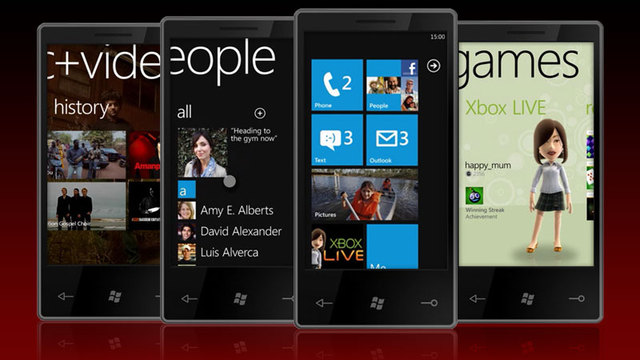
There has been a few different (dead) UI that I want to "bring back", and the WP7/Metro vibe that Microsoft have going on about 10 yeras ago, is probably the easiest one to get started with: It's flat AF, it's square AF, and it has the most consistent design across the board (which in hindsight might not be the best idea for a product, but that's discussion for another time).
Oh and for those who are curious, the others that I want to try (if I ever got the time & energy) would be
- The never-come-into-fruition webOS redesign, codename Mochi
- Whatever the Motorola E680i / A1200 is using, cause nostalgia.
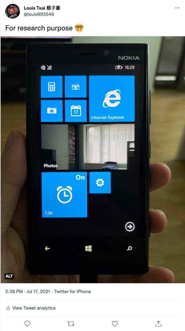
And for the basics of what I wanted to create, it's actually pretty straight forward this time: Unlike the Compose95 project, I don't have to come up with new ideas on what to actually build (because building the full Windows 95 experience on a tiny phone is not practical to begin with). I can literally just build what the entire phone experience would be like, so that's what I have been doing on-and-off for the last year. I even got myself a Nokia Lumia 920 to play with
So here are some of the things I have build & learned
Launcher (and the grid that makes it all possible)
Obviously the first thing that anyone would see is what the "launcher" screen looks like, and that also was one of the most fun part of this pet project:
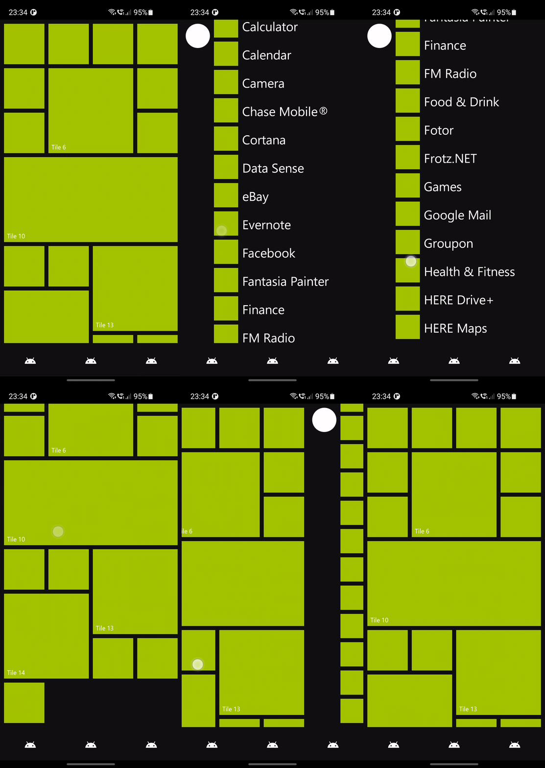
Originally WP7 only does a 2-column-grid of cells, and gradually they evolve to support both bigger and smaller cells, and up to 3/6-column-grid (depending on how you count it) system. And so the challenge I have here is to figure out a somewhat flexible API to define what cells are on screen, without having them always doing like a full blown coordinate system.
It has been a while so I don't have all the details, but what I remember is that I basically just go to the implementation of Column/Row, and try to figure out what they are doing inside, in which I found Layout, which seems to be the one with all the API I need to build this thing. And all I have add on top of it is just sprinkle on some simple counting to see "ok, you want a 2x2 cell, can you go on the current row, or do I need to create a new row for you" kinda calculation. And for most cases it works really well! I just have to figure out how to actually finish it by
- Figure out how to do drag-and-drop in compose
- Figure out what is the minimum amount of data I need to store to properly support ordering
- Figure out what is the 2022-way of storing this kind of data. I heard data store a few times, or should this be a table in SQL? Or is
SharedPreferencegood enough??? - How to do the WP8 style wallpaper?
If you are curious, here is the code.
Get myself familiar with Gradle and modualization (again)?
One thing about building a fake OS is that I got to build seperate "apps" that has nothing to do with each other, which makes it a great candidate to try out modualization with very little consideration. And to give you an idea of how it grows over time:
- Starts with 2 module: the
demoand themetro(library with the themes) - Start spitting out modules from
demo: first there iscalculator,settingsandmetro_settings - After looking at some build scans, realized that the
demois still relatively much bigger then the others, and start splitting the home screen out as well:vertical_tiles_gridbecome its own thing, and then thelauncher,app_drawer,app_search, basically try to getdemoas thin as possible - Realized that now half of the module now has all the same boilerplate in their
build.gradle, and just the other day a good colleague was talking about convention plugins in Gradle, so I give that a try and so far so good 👍
While it was quite fun doing all these, turns out you can keep doing this forever and it will never be perfect. Who would have though!? /s
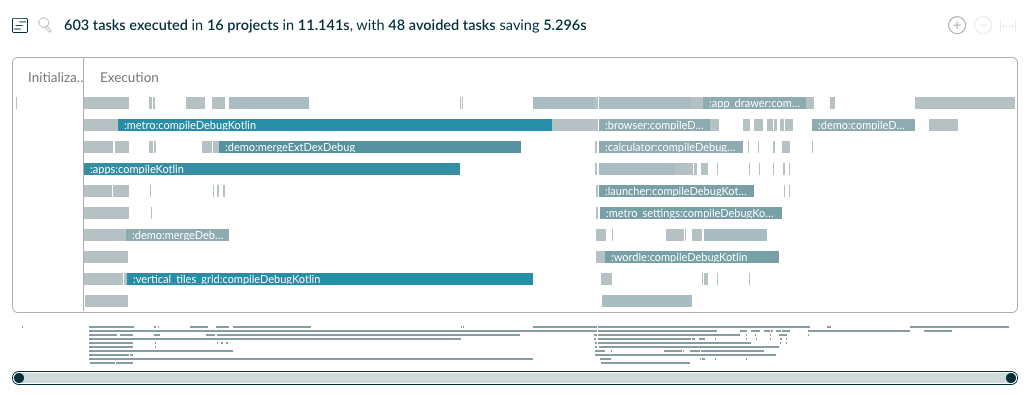
Given that a clean + --no-build-cache assembleDebug only takes <12s on my shiny new Mac Studio at this point, I think it's safe to say it's more than good enough for me to continue developing on this for quite a while. Maybe at some point I will need to figure out why configuration cache always fail the build on CI, but again 12s for basically clean build is perfectly acceptable.
Just have fun with GitHub Actions
Given that this is "suppose" to also be a library that people can use to build Metro-style apps, I get myself to try to figure out how to publish the library to the internet. If I remember correctly, I did that shortly after the whole "jCenter will be discontinue soon" situation, and also publish to Maven Central still kinda sucks, so I just did the lazy thing and publish it to GitHub Packages, which then of course only makes sense if I use GitHub Action.
And as someone who has been using internal/specialize CI/CD at work for the last 3+ years (and before that I have tried CircleCI iirc), it's kinda nice to know what's everyone using. So I ended up setting up
- API check (for the library)
- Build
- Publish to Play Store
- Upload library to GitHub Packages
And it ended up being way more fun than I though it would be. Now everytime I push something to main, a few hours later my Android phone will also be able to update the app (if it doesn't have the debug build already 😝). Could I have done that with other CI/CD? Probably. Do I think it might not be the best idea that MS/GH is kinda IE-ing the entire CI/CD market, by providing action for free because they have the money? Yea kinda. But as a sucker for freebies, I'll take it 💰
Honestly at this point I am mostly just building the demo app at the moment, most recently a Wordle clone (Oh my god it would have been the perfect WP7 style app if it exists back then), and not really doing much with the library. But that's what it takes to keep this side project fun, that's why I will do.
All I am saying here is that this is NOT to promote the library (cause it might never get ready), or get you to try out/contribute, but they are always welcome 🤗
Happy Easter everyone from 🇩🇪🇩🇪🇩🇪
Random Compose Project #2: Metro-Compose
TL;DR: I am a sucker for building design system from old/dead OS
